Wednesday, July 26, 2017

Design Radical

The retrospective of Ettore Sottsass at the Met Breuer boasts a subtitle: Design Radical. Unfortunately, the radical aspect of the great master’s work is something not explained, not emphasized, and ultimately not 
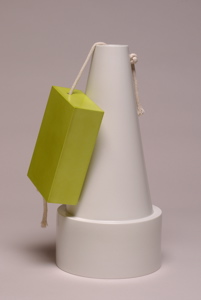
clear in the context of this surprisingly conventional exhibition.

I remember seeing Ettore Sottsass’ last produced ceramic vases in an exhibition in Cologne a few months after the legendary designer’s death in 2007. In his late years of life, the master reached an unprecedented clarity of vision. His designs became uncompromising meditations on the essence of objects. A case in point is this remarkable vase for Sevres: perhaps, the most conceptual design object ever made.

The vase itself is a utilitarian vessel: it resembles a traffic cone rendered in plain bathroom porcelain. From the functional point of view, this is an essential minimum that is needed for holding a bunch of flowers: no more nor less. But what about the decoration? Aren’t vases supposed to have some kind of decorative treatment? Oops, Sottsass seems to say, and he provides his “decoration”: a functionless porcelain block in trendy chartreuse-green color, dangling on the side as if an afterthought. This unusual decoration is not even “applied” in any permanent way. Rather, a simple rope with two knots holds is in place. Go ahead, remove it if you find it so annoying, ­Sottsass seems to imply.

However, if you mentally imagine this object without the green block, the entire vase seems to lose its interest, or raison d’etre. The decorative element may be absurd, yet it is absolutely essential for the object’s appeal. The functional is connected to the nonfunctional with a precarious umbilical cord. One component feeds and supports the other. And here is the lesson of the master: in our human experience, immaterial things like decoration, color, emotion are as necessary as the function itself; without the former the latter does not have much meaning at all.

In fact, Ettore Sotssass' entire creative life was devoted to proving this simple thesis. I wish the Met exhibition was able to bring this notion straight to the visitors, especially to young design students of today. The new generations should be able to see Sottsass not as a whimsical post-modernist but as a true and timeless Design Radical.


(This post is based on my old blog entry of 2008)

Monday, October 10, 2016

Parallel Universe


Having recently returned from a trip to Peru, I have been captivated with the history and material culture of the Incas.

The Inca civilization developed without any contact with the world outside South  America. They built magnificent and earthquake-proof  structures and fortifications, but their builders did not know how to make an arch. They connected their vast empire with a network of roads and bridges, but they did not invent a wheel (it had almost no use in the mountainous regions of the Andes). Most importantly, they had no writing; their records and history largely depended on an oral tradition.

If the Spanish conquest of the 1530s did not take place, it is likely that the Inca Empire would continue on without these essential (from our Western point of view) cultural accomplishments.  As conquerors of every continent,  we perceive our Western civilization as the only possible alternative to the course of human development. Yet have there been any other alternatives, along the way? What could have possibly happened differently?

I recall the little book of Japanese essayist Junichiro Tanizaki In Praise of Shadows, where he imagined a speculative world evolved from the Japanese point of view:
“Suppose for instance that we had developed our own physics and chemistry: would not the techniques and industries based on them have taken a different form, would not our myriads of everyday gadgets, our medicines, the products of our industrial art – would they not have suited our national temper better than they do? … The Orient quite conceivably could have opened up the world of technology entirely its own.”


Indeed, contemplating the alternative possibilities for our material universe should be a fascinating subject matter for designers and design students alike. Conceptual speculations of this sort are guaranteed to yield many new discoveries and inventions.

Saturday, April 16, 2016

Designer Robinson Crusoe


After about 50 years, I decided to re-read the book Robinson Crusoe, driven by a suggestion of architect Daniel Libeskind, of all people. Talking about our primary need for furniture, Libeskind mentioned how Robinson Crusoe, barely having settled on his island, had an overwhelming desire to have a chair and a table:

“I began to apply my self to make such necessary things as I found I most wanted, as particularly a chair and a table, for without these I was not able to enjoy the few comforts I had in the world, I could not write, or eat, or do several things with so much pleasure without a table.”

Only when Crusoe fashions these items–with great expense of time and labor– he is able to sit down and start his Journal, which continues for the next hundred pages of the book.  Daniel Defoe’s book has a strange double life. In simplified abridged form it became a timeless bestseller, an adventure book for children of all ages and all nations. The original version, however, is a more complex existential narrative, full of doubts and reflections, an example of one of the first psychological novels in history of literature.

Still, what attracted me – and probably Daniel Libeskind as well – was the fact that Robinson Crusoe had been also a first book about design. The material culture of things, processes, and making is the most important part of the narrative. The list of items that Crusoe salvaged from the wrecked ship takes many pages, and it makes a surprisingly fascinating reading.

What follows is even more captivating. Defoe provides detailed descriptions of how his hero conceived, planned, and made things that fulfilled his daily needs for a relatively comfortable life in the wilderness.  All in all, Crusoe’s method is not very different from the approach of today’s environmentally conscious designers, for example:

– Recycling, re-purposing of materials and resources, both natural and man-made.
It turns out that almost anything could be procured or made from the limited supply of available materials and tools.

–Slow design. It takes him weeks, and sometimes months, to make relatively straightforward items, yet the results are infinitely satisfying.

– Desire for beauty and perfection. Crusoe is not satisfied with mere functional aspect of the items he made. Not without a sense of humor, he constantly comments on awkwardness and ugliness of things he was able to make, due to his lack of skills and proper tools. His first fired claypots functionally served him well, but they looked “as the children make dirt-pies”. After subsequent experiments with self-made potter wheel, Crusoe proudly notes:

”I arrived at an unexpected perfection in my earthen ware and contrived well enough to make them with a wheel, which I found infinitely easyer and better; because I made things round and shapable which before were filthy things indeed to look on.”

If anything, this is an essence of design. “Robinson Crusoe studio” could be a great assignment in today’s design college. When students spend a semester reinventing everyday things with limited supplies and minimal tools, they would reassess the abundance of our material culture, which we too often take for granted.


Wednesday, January 6, 2016

Post No Bills


Everyone in New York sees them every day.

As long as the city’s real estate boom goes on, new construction sites are popping in every neighborhood, surrounded by rough plywood fences painted blue or dark green. On these walls, every dozen feet or so, there is the inevitable sign: POST NO BILLS. In my own neighborhood, the Lower East Side, hundreds of these stenciled messages appeared seemingly overnight, as construction of the mega-project on Essex Street picked up steam. Finally, I paid attention.

Curiously, this everyday insignia is perhaps the last piece of history remaining on redeveloped city sites. The language itself says it all: to most people today, “bills” mean electrical or phone bills, not advertisements. “Posting” means writing something on one’s blog, not affixing anything on the wall. Where does this expression come from? I spent some time on the Internet, but failed to determine the origin of the sign. One thing is clear: it is old. There was a short silent film, made in 1896, called Post No Bills, where two street urchins squabble over pasting their bills over a wall, only to be chased by a policeman – a quite contemporary situation.

What interests me most, however, is the “design” of the stencil. There are variations, but they mostly follow the same arrangement: three words stacked up in a roughly square format. There must be someone, generations ago, who came up with this layout, which continues today all around the Unites States with little or no change. The stencils for making these signs are offered for sale by several manufacturers online (at a steep $40-$50 apiece). Surely, no royalties are paid to anyone. One unknown designer, like Milton Glazer of a bygone era, remains responsible for an icon that handily outlived his own time.


Everything that has been designed, could be re-designed. I keep wondering when some stencil-making company commissions Stefan Sagmeister – or even Pentagram – to come up with an alternative POST NO BILLS look, the one they’d consider more fitting for upscale neighborhoods of Chelsea or Upper East Side.

Monday, August 17, 2015

Designing His Life and Death


I will never forget my first encounter with Steven Holt. In 1986 I moved to New York City, fresh from two exhilarating years at Domus Academy in Milan, anxious for attention to my work and eager to make a mark – the goals that proved highly evasive at first. Walking on West Broadway in Soho – it was a sunny day in spring or early summer – I heard someone calling my name. I turned and saw a blond guy of my age, who was flashing a most incredible and contagious smile: “Constantin? I know who you are!” At the time Steven was the editor of I.D. magazine: he probably received and remembered my odd mailers. Our first long conversation took place on that sunny sidewalk.

If there ever was such thing as professional love at first site, that was it. Many more talks followed, then joint projects. In design, we liked and shared many similar things: conceptual clarity, cultural sampling and pop-culture mash-ups, humor and provocation. Andrea Branzi and Ettore Sottsass were our mutual idols. Eventually Steven brought me to teach product design at Parsons, thus setting my career on the long track of research and experiment.  Then, at the height of his professional standing in the New York design scene, Steven surprised everyone by his decision to leave for post-graduate studies at Stanford. After his departure I took over his job at Parsons and his apartment in the Village. It seems, in our relationship I was always on the receiving end.

Steven’s life in San Francisco has been interesting and a little mysterious. For years he had an official title of “design visionary” at frogdesign, and only laughed when I tried to inquire about precise nature of such work. Then he taught at CCA, becoming a distinguished professor, beloved by generations of students.  In San Francisco he met his wife Mara, with whom he shared everything, from their combined name to joint efforts in writing books and curating exhibitions. Their apartment, and their life itself, was like a curated display of books, art, and design.

For as long as I can remember, Steven’s health was a problem. Occasionally, he would disappear from radar for weeks, if not months: not pick up his phone, leave
e-mails unanswered. One of these bad periods happened when I was working on my first book Curious Boym in early 2000s. I could not picture anyone but Steven writing an introduction when he was overcome by another bout of his illness. Weeks went by without any communication. The editor already gave up, yet Steven’s article arrived just on the deadline; it is a best piece of writing in the entire book. Over the years, I got to rely on him always coming back, and saving the day with his inimitable goofy smile.

When I received Steven’s good-bye call on August 11, at first I was certain in another prompt comeback. Yet this time it was different. Just like he was designing his whole life, Steven Skov Holt took pains to design his own death. With help of Mara, every detail has been worked out. His body was pledged for hospital surgeons’ training, while his brain was to go to Alzheimer’s research. He called his close friends to say farewell. They videotaped his message to the future, “a culmination of what he believes design can and should do in the world and for the world”, in Mara Holt Skov’s description. On August 13, 2015 Steven passed away in his living room, in the company of his wife, his son Larson, and his mother, surrounded by his favorite objects and books, with Jimi Hendrix playing in the background.

He said he was a happy man.


Wednesday, July 22, 2015

Flags to Rags


Flags to Rags are kitchen towels, which feature flags of countries that no longer exist.
 
“Flags are among the most immediate, primal, and communicative forms of design. They are made of icons and become icons themselves,” wrote Paola Antonelli, MoMA’s senior design curator. But what happens when an icon outlives its’ time and purpose? The leftover flags are sometimes venerated, and sometimes reviled – often at the same exact time. Their function is far from clear. Our project of kitchen towels plays with this historical and cultural ambiguity.

The original set included flags of the U.S.S.R. (†1991), German Democratic Republic (†1990), and Yugoslavia (†1991). Recent controversy that surrounded the display of the Confederate flag, prompted us to add it to the Flags to Rags collection (†2015).

These cotton towels are perfectly functional. The flag iconography not only endows the cloths with an additional layer of meaning, it also challenges their suggested utilitarian usage. Flags to Rags demonstrate how critical design can enrich and subvert a conventional object’s experience.

The towels are not yet in production.