Wednesday, December 9, 2009

The Bust of Gold

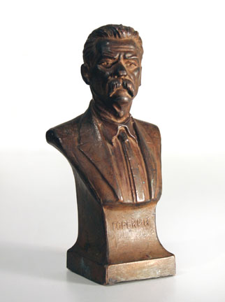
As long as I could remember, this small bronze bust of famous Russian writer Maxim Gorky stood in my grandmother’s cupboard, among the tea sets, crystal, and other so-called family treasures. Even in my childhood, something did not seem right about this object. Why did our Jewish family keep this portrait of the most official and little-loved Russian classic? Why would my kind grandma always firmly say: “Put it back!” when I reached for the sculpture, on rare occasions when I was permitted to handle the contents of her cupboard?

Many years passed before I found out, quite by chance, a strange story of our bust.

By the late 1920s, the victorious Soviet power has declared war on its own citizens. One of the acts was a decree of confiscation of all people’s gold and jewels. Non-compliance could mean arrest, seizure of all property, and deportation to the newly established system of labor camps, the notorious Gulag.

My grandparents, of course, had a bit of savings, converted into gold coins so that it could survive inflation. They euphemistically referred to it as “something for a rainy day”. Keeping one’s own gold rather than surrendering it to the State, was not a matter of greed. Rather, it was an act of human dignity; perhaps, even an attempt at civil disobedience. They decided to sew the gold hoard into a mattress, where it laid untouched for the next twenty years.

By 1948, in the aftermath of the World War II, the aging and increasingly paranoid Stalin had initiated a statewide anti-Semitic campaign. Rumors were abound about the imminent roundup of all Jews for a forced resettlement far in the Eastern Siberia. In the face of these new dangers, our family gold in the mattress was no longer safe. It seemed unlikely that mattresses would be allowed to be taken along into the exile. My grandparents looked for a less conspicuous and more portable safe.

I do not think they saw any irony in picking the bust of Stalin’s favorite writer for hiding their coins. If anything, this seemed like an extra safety measure. They sealed the gold inside the sculpture with candle wax, where it laid hidden for another forty years, outliving the Soviet Union itself. The rainy day never came. In the 1990s, when possession of gold became a virtue rather than a crime, my mother melted the wax and released the coins, which were divided among the family.

Determined to bring this unusual souvenir back to New York, I was going through Moscow airport security when a customs official noticed a strange item in my suitcase. “It’s just a family thing, nothing valuable”, I showed him the empty bust. “Strange,” he said, “on our screens here it shows like gold”. I only smiled. The aura of gold was still there, detectable by their fancy sensors, yet the treasure itself had turned into memory, something that no State power could ever take away.


Sunday, October 18, 2009

My Fiorucci


When I studied in Milan in the mid-1980s, Fiorucci store was a place of pilgrimage for nascent designers. In visual terms, the store looked like a complete opposite of MOSS: noisy, cramped, full of tourists, cluttered with colorful screaming things. If anything, it was a design version of Oriental bazaar. One could always be sure to find something new, weird, and unexpected.

Elio Fiorucci came from the family of shoe makers. Ever since his first success, making galoshes in primary colors instead of black, he loved color and pattern. In a typical Italian way, he made no distinction between furniture, clothing, and fun novelties, and his store mixed everything together. The shop’s windows on Corso Vittorio Emmanuele became an important stage for the most outrageous projects and performances of New Italian Design. Alessandro Mendini’s Dress Furniture was shown there, and so were Memphis objects and installations. In The Hot House, Andrea Branzi calls the place “one of the most progressive and well-informed cultural milieus in Milan”. (Some people will say the same about Fiorucci’s short-lived New York shop, but that’s another story, not mine.)

Among endless accessories produced by Fiorucci every summer season was this irresistible silk wrap. Two stylized grotesque types are having a drink on the beach, with a bomb falling in the background. The colors and the style unmistakably point to Nathalie du Pasquer, one of the original Memphis designers. Hardly any design student of today will have any sympathy to this strange drawing, prescient and dated at the same time. Yet back in the 80s, this wrap was too precious for me to put it to any practical use; instead, it hung on the wall like an odd tapestry in my shared apartment in Milan. Who knows, maybe the idea of my future Buildings of Disaster was hatched while contemplating this dystopian image.

After many financial troubles and changes of ownership, Fiorucci store finally closed its doors in 2003. There is no other place like that in Milan today.

Saturday, September 5, 2009

When Design Was Thrilling


The other night, I introduced to my son North by Northwest, a 1959 Hitchcock’s classic with a “design theme”, and soon we were both entranced.

In mid-century cinema, modern design either served as a symbol of human alienation (Antonioni), or was ridiculed for its awkwardness and sterility (Jacques Tati). In contrast, Hitchcock acknowledged modern design for its spectacular, thrilling potential, not without a certain sinister edge.  A series of dramatic shots of the UN Building in New York City (newly constructed at the time of filming) end up in a murder. A hyper-modern house of the film’s evil protagonist also becomes a scene of deadly confrontation. In this context, it makes sense that the leading lady, a secret service agent, gives her occupation as “an industrial designer”.

Far from offering any commentary on these modernist backgrounds, Hitchcock was simply affected by their fresh visual impact. In this, he prefigured the age of glossy fashion magazines, where contemporary architecture is often used to the same superficial effect – which by now lost any possibility to thrill.


Monday, August 24, 2009

Jonathan Swift, the First Design Critic

Stranded without books in our country house in August, I picked up at random an old copy of unabridged Gulliver’s Travels – and was instantly hooked. This book has a strange double life. Retold for children around the globe as a fun adventure story, the original text is actually very bleak, a bitter and misantropic satire of human mores and history.

In Part III, the author visits the flying island of Laputa and the kingdoms on the islands below. Immediately, Gulliver notices strange dysfunctional state of those territories: everything is in disrepair; people toil without any discernable results or benefits, even though sophisticated machines are always at work.

Explaining the reasons for this sad state of things, Jonathan Swift (writing in 1726) prefigures many future critics of Modernism.  He puts in question the general effort of designers (Swift calls them projectors) to improve and innovate everything possible under the sun.

In the book, Gulliver learns that some young people came down from Laputa with little education, but with a strong desire for change. “These persons upon their return began to dislike the management of every thing below and fell into schemes of putting all arts, sciences, languages and mechanics upon a new foot.” They “contrive new rules and methods of agriculture and building, and new instruments and tools for all trades and manufacturers.” “The only inconvenience is, that none of these projects are yet brought to perfection, and in the meantime, the whole country lies miserably waste”.

Further on, Gulliver visits the Academy of Projectors (something like our Eindhoven Design Academy), and familiarizes the reader with some of their absurd innovations. The projects range from Droog Design-like experiments (producing the breed of naked sheep, without any growth of wool), to visionary architectural endeavors, such as “a new way of building houses, by beginning at the roof, and working downwards to the foundation, which the architect justified by the like practice of those two prudent insects, the bee and the spider.”

It is documented that Swift was well versed in science knowledge of his day. Whether he was suspicious of innovation in general, or just was wary of certain design excesses, we would probably never know.


Tuesday, July 21, 2009

Timeless Objects


In the course of a quarter-century of working in design, I have seen a kaleidoscope of styles. Every few years, a new trend, shape, or colors are promoted by mass media, soon to be culturally consumed and discarded as outdated. There is nothing inherently wrong with that. Shouldn’t design continuously aspire for new and different expressions?

And yet, in our profession persists an often-voiced desire for timeless everlasting values, for design described as permanent and archetypal, for qualities one finds in anonymous objects of everyday or in old industrial catalogues.

Our new collection attempts to make objects as timeless as ancient bronze monuments.

Inside each piece there is “a found object”: either a disposable item or an anonymous thing culled from the mundane texture of our everyday life. Once we apply our special treatment, the familiar shapes start to look and feel like bronze sculpture. Trivial objects suddenly look permanent and essential. Are these pieces brand-new, or have they been made long time ago? We imagine objects that defy time and obsolescence, things that withstand fluctuations of trends and style.

Making Timeless Objects has required a great deal of time and experimentation. The material is applied over the surfaces of the objects with our own proprietory technique. All pieces are made by hand at our studio, in a limited edition. Each object literally carries the fingerprints of its maker.

Timeless Objects will be presented to the public at ExperimentaDesign in Lisbon in September 2009 and at Cooper-Hewitt National Design Museum in October 2009. On November 3rd 2009, a personal exhibition TIMELESS will open at Wright in Chicago, where we will present unique works created to accompany the edition pieces (more info at www.wright20.com).

Selected objects from the collection are distributed by Wabnitz Editions (www.wabnitzeditions.com).

Thursday, June 18, 2009

Things I'd Like to Design


In interviews, I am often asked what I would like to design next:  a strange inquiry, considering that we designers are rarely given a choice in these matters.

Last evening, I was re-reading old texts by Alessandro Mendini, a visionary Italian master and my one-time mentor, who himself often marveled at design’s limits and possibilities. In homage to Mendini, I have compiled my own partial list of things I’d like to design, if I had a chance. Here it is:

Tools, cast in bronze, for cultural work

Trays and cabinets where to put those tools

Objects to relieve spiritual pain

Objects to provoke thought

Objects glimpsed in a dream

Hilarious objects

Timeless objects

Sub-objects

Objects my parents could understand

Objects that carry message

Objects that hold memories

Objects that keep a secret

Buried objects

Unconscious objects

Objects to throw into the sea

Objects to leave on top of the mountain

Things to keep in the attic

Briefcase for the ultimate journey


Friday, April 24, 2009

Monument to Lloyd Schwan


This strange object is parked at the door of our studio. As it is heavy enough, we occasionally use it as a doorstop. Most people, including our interns, take it for one of our own prototypes, or a part of some old project. Hardly anyone can guess that the object is, in fact, a candleholder. And no one knows that it was made by Lloyd Schwan, an American designer whose life tragically ended in 2001, at the age of only 45.

I had met Lloyd a few years earlier – in Paris, of all places – where we were seated next to each other at a post-opening dinner at Neotu Gallery. This was the first, and as far as I know, the last time that a group of American designers would have an exhibition in Paris. Inevitably, we started talking. Lloyd's views of design were startling. He wanted to design the way a child would draw – without any inhibitions, with little or no self-control, with creative freedom
unburdened by any kind of cultural baggage. Even though my own ways were almost entirely opposite, we found that we shared one passion: the love of all things American. At the time, I had made and presented Searstyle furniture already. He, from the other hand, was experimenting with Formica, colored vinyl, parts from industrial mail-order catalogues. After several random meetings, we decided to collaborate on a show.

In retrospect, it seems strange how we could find any common themes: me, born in Russia and educated in Milan, and him, who grew up in Chicago and was living in Pennsylvania. We settled on an idea of exhibition as design conversation – it was called "Conversation Pieces" – and it gathered crowds when it opened in May 1999, when ICFF was still in its infancy. I believe, it was for this exhibition that Lloyd made his heavy lamps and candleholders. He simply welded together random stacks of large steel nuts, washers, and other industrial parts, and had them all powder-coated off-white. The objects, though relatively small, had a quiet power of heavy machinery.

At dismantling of the show, Lloyd noticed that I was eyeing one particular piece with longing. "Just take it, I don't want to carry it back", he said. He has already started to leave things behind; later, he also parted with people and friends, even with his wife and their three children... Ten years has passed since our last design "conversation". The candleholder without a candle remains by our door, like a small and very private memorial.

Tuesday, February 17, 2009

The Last Vase


I saw Ettore Sottsass’ last vases in an exhibition in Cologne a few months after the legendary designer’s death. In his late years of life, the master reached an unprecedented clarity of vision. His designs became uncompromising meditations on the essence of objects. A case in point is this remarkable vase for Sevres: perhaps, the most conceptual design object ever made.

The vase itself is a utilitarian vessel, like a traffic cone rendered in plain bathroom porcelain. This is an essential minimum that is needed for holding a bunch of flowers, no more nor less. But what about the decoration? Aren’t vases supposed to have some kind of decorative treatment? Oops, says Sottsass, and he provides his “decoration”: a functionless porcelain block in trendy chartreuse-green, dangling on the side as if an afterthought. This unusual decoration is not even “applied” in any permanent way. Rather, a simple rope with two knots holds is in place. Go ahead, remove it, Sottsass seems to imply, if you find it so annoying.

Now, on the image above, try to cover the green block with your finger and imagine the object without it. The entire vase seems to have disappeared. However absurd this decorative element is, it is absolutely essential for the object’s existence. The functional is connected to the nonfunctional with a precarious umbilical cord. One component feeds and supports the other. And here is the lesson of the master: in our human experience, immaterial things like decoration, color, emotion are as necessary as the function itself; without the former the latter makes no sense.

In fact, Ettore's entire creative life was devoted to proving this simple thesis.

Friday, January 2, 2009

Vanitas, 2009


Vanitas still life paintings, perennial crowd-pleasers in today’s art museum collections, originated in the Netherlands in the early 17th Century. This was the answer of Dutch protestants to the excesses of the Papal Rome, a not-so-subtle reminder that all earthly glory and material success was, at best, transitory.

At the outset of 2009, as we Americans face a sobering reality, the theme of Vanitas suddenly seems as fresh and timely as ever. Better still, why not a Vanitas Mirror? A dressing table mirror, known as “vanity”, is already a fixture of many bedrooms. The Vanitas Vanity would provide a contemplative note to start the day, to put things in perspective, and to be grateful for what we still have
.

Happy New Year!